Today I am starting up a new feature here at THB — Five Figures. Every month, I will share five (or so) of the most provocative, interesting, or challenging figures to have recently crossed my desk.
Five Figures adds to the features and content available to THB’s paid subscribers — which you can find here.
Before making the jump to the figures, a quick postscript to my post earlier this week on extreme precipitation versus floods, and why we might see trends in the former but not the latter. There has been a growing literature on this question, and below are some peer-reviewed articles that reinforce my post — with some rare criticisms of climate scientists who promote false claims about flooding:
- Sharma et al. 2018: “Despite evidence of increasing precipitation extremes, corresponding evidence for increases in flooding remains elusive. If anything, flood magnitudes are decreasing despite widespread claims by the climate community that if precipitation extremes increase, floods must also.”
- Wasko et al. 2021: “We found that, across many regions in the world, in the absence of snowmelt, changes in flood magnitude do not follow increases in peak rainfalls.”
- Ivanic and Shaw 2015: “It is firmly established in the hydrologic literature that flooding depends on both antecedent watershed wetness and precipitation. One could phrase this relationship as “heavy precipitation does not necessarily lead to high stream discharge”, but rarely do studies directly affirm this statement. We have observed several non-hydrologists mistake trends in heavy precipitation as a proxy for trends in riverine flooding. . . “Do very heavy precipitation events lead to very high discharge events?” In this paper, we directly evaluate this question, providing a clear conclusion that precipitation should not be viewed as being directly related to discharge, and that trends in very heavy precipitation should be used cautiously to infer trends in very high discharge.”
Thanks for reading!
Costs of Thermal Electricity vs. Solar + Battery
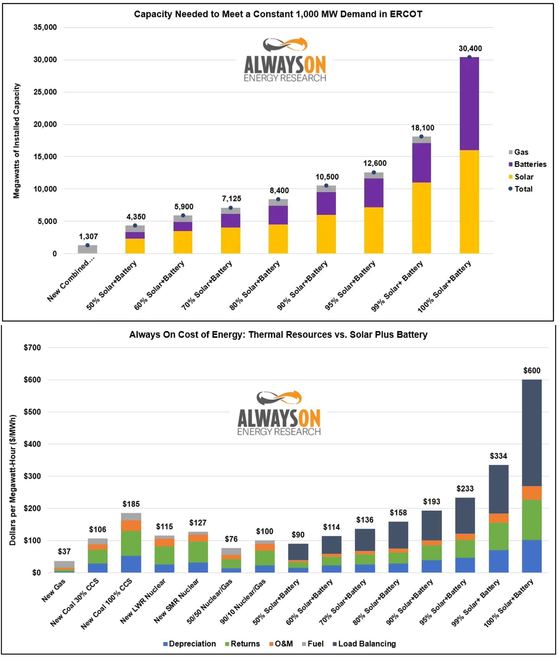
The two figures above come from the Energy Bad Boys on Substack — the top figure shows needed capacity for various technological combinations and the bottom figure shows the estimated costs of various technological alternatives.
They explain of these figures:
Earlier this year, we worked with the Utah Department of Energy Development on a project to model the standalone cost of energy resources providing a constant 250 MW of power over a five-year period, accounting for historic hourly fluctuations in wind and solar capacity factors.
For the purposes of this article, we tweaked our model to require the delivery of a constant supply of 1,000 megawatts (MW) of power 24 hours per day, 365 days per year.
They explain:
We also modeled the cost of meeting 1,000 MW of demand with a host of other technologies based on the EIA Annual Energy Outlook cost assumptions. The graph below shows the cost of reliably meeting the demand with various technologies.
As you can see, new light water reactor nuclear plants could meet this demand for $115 per MWh, which is much lower than the $193 per MWh for 90 percent solar and batteries. Even new coal plants with 100 percent carbon-capture and sequestration, an unproven technology, would be more affordable based on EIA capital cost assumptions, meeting the demand for $185 per MWh.
The whole post is worth a read, and explains why their estimates differ so much from a recent set of numbers from Ember.
A Silent Demographic Shift is Underway
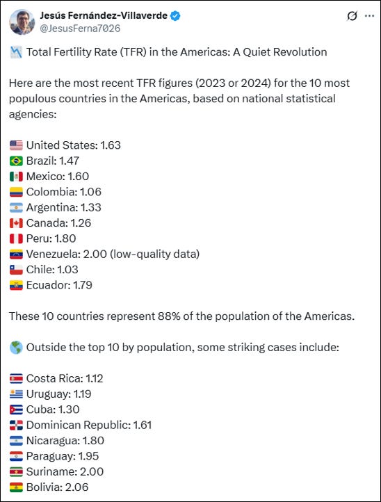
From my AEI colleague Jesús Fernández-Villaverde (on X) comes the recent data on total fertility rates in the Americas. Fernández-Villaverde explains:
Key observations:
- Every major country in the Americas is well below the replacement rate of 2.1. In some cases, dramatically so—see 🇨🇱 Chile and 🇨🇴 Colombia.
- From Alaska to Tierra del Fuego, the Americas are a low-fertility continent.
- The few remaining exceptions (🇬🇹 Guatemala, 🇭🇹 Haiti, 🇭🇳 Honduras) barely hover above 2.1—and are falling fast. Note: Haitian data is particularly unreliable.
- The major inflection point seems to have occurred around 2014.
- The real puzzle isn’t why the U.S. TFR is low, but why it’s still so high compared to the rest.
A silent demographic shift is underway, and its consequences will be felt across generations.
Read much more on fertility trends and projection from Fernández-Villaverde here.
A new paper just out at NBER by Melissa Schettini Kearney and Phillip B. Levine asks, Why Is Fertility So Low in High Income Countries? Among their conclusions:
[I]t is important to recognize the international nature of the phenomenon of declining fertility. Fertility rates are declining—or stagnating at low levels—across virtually all high income countries. This pattern suggests that the underlying causes are unlikely to be country specific. Our review finds considerable cross-national similarity in the effectiveness of various interventions, despite very different institutional contexts. At some point, we may need to recognize that people have similar preferences, priorities, and constraints around parenting, regardless of their country of residence, and their choices may be shifting in similar ways. . .
If a society decides that increasing the birth rate is a priority, how should it proceed? The short answer is that there are no easy fixes. There is no single policy lever that will reliably boost fertility. . .
Our review of the evidence indicates there is still so much more we need to know before we can provide something resembling a definitive answer to why birth rates in high income countries are so low.
Public Confidence in Universities Rebounds, A Bit
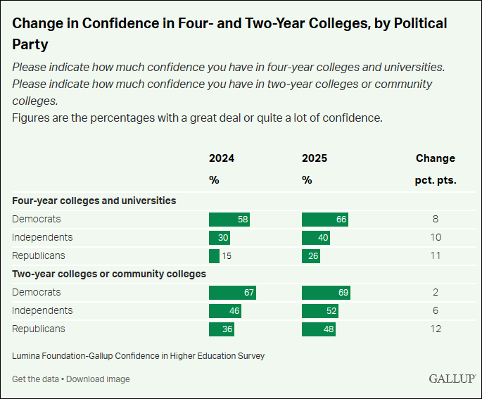
A June 2025 Gallup poll finds that public confidence in colleges and universities has increased since 2024 — the first uptick in a decade. There remains a huge partisan divide, but the largest increase in confidence comes from Republicans. Among those who have the least confidence in universities, the top reason they give is “political agendas”.” See the Gallup Poll here and a recent six-part THB series on universities here.
Decelerating Per Capita Economic Growth
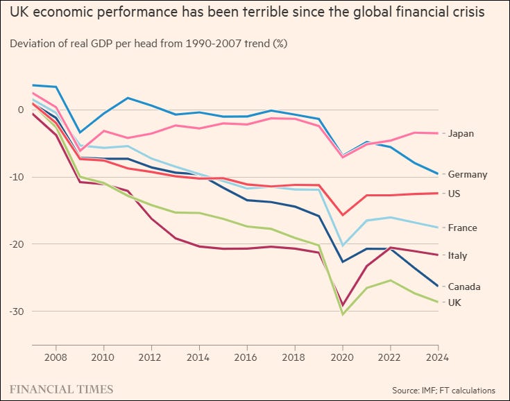
The Financial Times published the graph above showing the deceleration of economic growth in seven countries as compared to the pre-global financial crisis trend.
The slowdown in economic growth has profound consequences across societies and politics. My colleague Matt Burgess has written some good papers seeking to understand why growth is slowing, and what it may mean for growth projections and broader societal implications.
The Forgotten Drought of 1765–1768
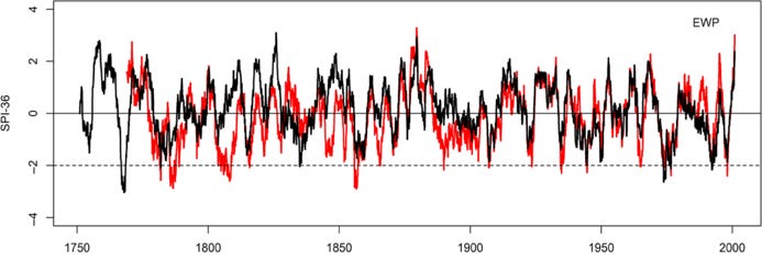
Ryan Maue calls my attention to a fascinating paper on drought in the British Isles from 1748 to 2000. Murphy et al. 2020 find that the most severe drought on record occurred in from 1765 to 1768. They conclude:
The most remarkable event in our reconstructions is the drought of 1765–1768, which ranks as the most extreme by most metrics across the three regional series (Table 1). This event is largely neglected by the research literature. . . Given the emphasis placed on using historical droughts for assessing water resource resilience in the UK (Environment Agency, 2017; Environment Agency, 2018), the 1765–1768 drought provides a far sterner test for evaluating water management and investment decisions than any other drought since. While some UK water companies have turned to stochastic simulation methods to test their supply systems to events worse than those observed in historical records (e.g., Water UK, 2016), such approaches are contingent on the training data used, which is often from much shorter records. Our extended series, and the benchmark droughts within them such as 1765–1768, could give added credence to drought frequency and severity assessments based on simulation approaches. Moreover, historical assessment remains a key default stress-testing option for a significant proportion of providers.
Neglect climate variability at some considerable risk in decision making.